When contemplating magazine cover page design, one is presented with an opportunity to evoke emotions, stir curiosity, and ultimately, engage the audience in a manner that is both visually arresting and intellectually stimulating. The cover page functions as the face of a magazine; it is the initial interaction that readers have with the contents between its pages. Thus, its design must be nothing short of captivating.
To begin, consider the pivotal role of color theory in magazine design. Color elicits emotions and can dramatically influence a reader’s perception. For a vibrant, youthful magazine targeting a niche audience, bold hues such as electric blue or vivid orange may resonate. Alternatively, for a publication steeped in sophistication, shades of muted earth tones—deep greens or warm browns—can project tranquility and depth. Thinking beyond mere aesthetic pleasure, the psychological implications of color should guide design choices. Readers should instinctively feel a connection, enriching their reading experience.
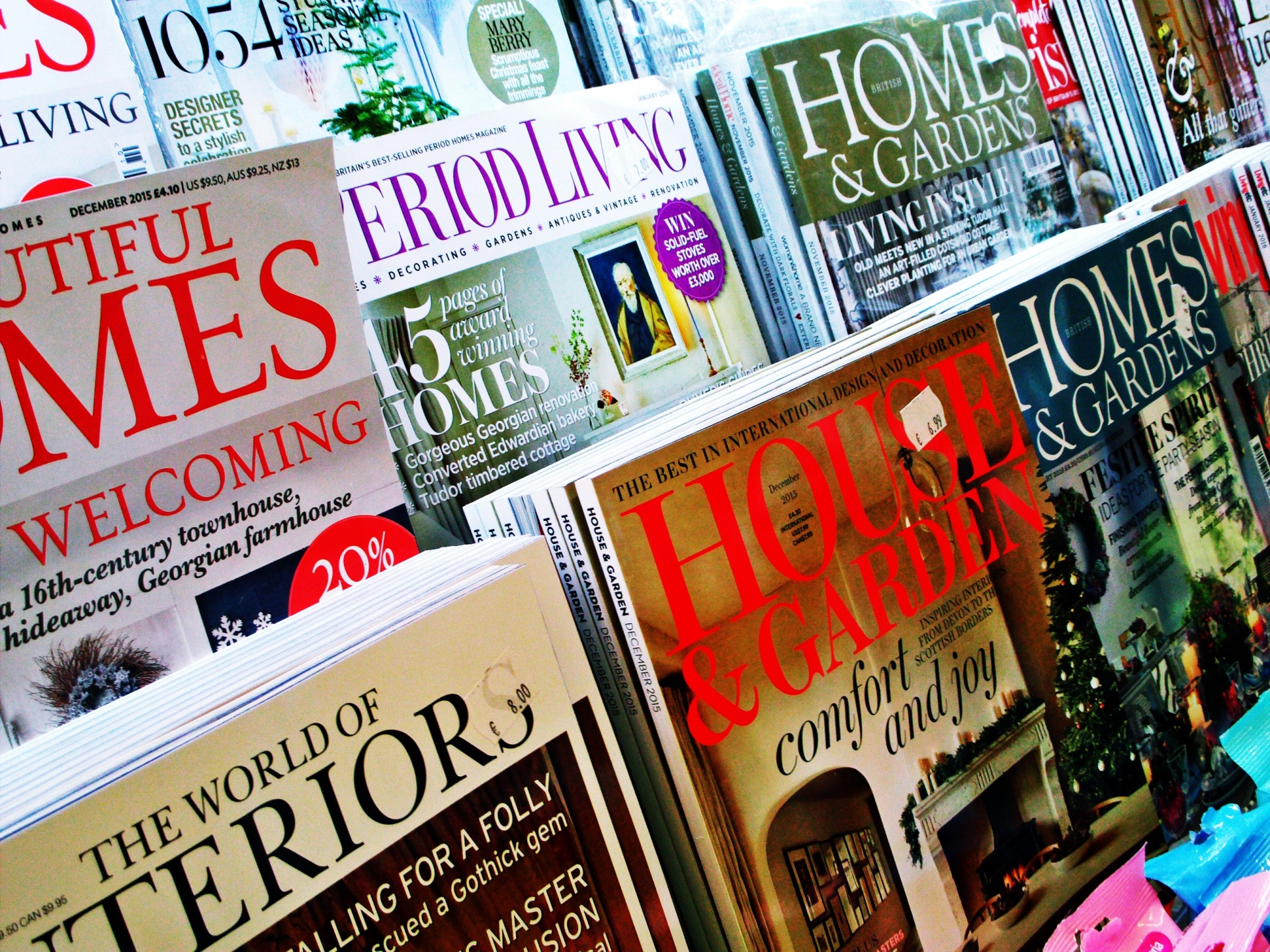
Next, typography emerges as a fundamental element of craft. The font style should align seamlessly with the magazine’s theme. A modern, sans-serif font can convey a sense of innovation and freshness, while a classic serif can imbue the cover with a semblance of heritage and gravitas. Hierarchical typography, where the title is dominantly displayed while subtitles or descriptors occupy lesser prominence, can guide the eye through the cover page, allowing for an intuitive navigation of designed elements. Moreover, consider the interplay of font sizes and weights; strategic contrasts can not only enhance readability but also create a dynamic visual rhythm.
Imagery plays a cardinal role in distilling the magazine’s essence. A striking photograph, whether candid or staged, can communicate a multitude of narratives. Conversational imagery can pique curiosity by showcasing not just what is, but what could be. For instance, a cover featuring an individual engaged in a community-building endeavor may intrigue readers to delve deeper into themes of social change. Alternatively, artistic illustrations may invite readers into a more abstract realm, fostering imagination and curiosity. It is paramount that the selected visuals harmonize with the content while offering a perspective that deviates from the norm.
Juxtaposition is another hallmark of innovative magazine design. Pairing contrasting elements side by side can foster an unexpected dialogue. For example, a bold, modern illustration can be exquisitely complemented by vintage typography, creating visual dissonance that arrests attention. This semblance of contradiction not only engages the viewer’s curiosity but also invites them to question the intricacies of the featured content. Instead of merely delivering a message, the cover can compel readers to contemplate broader societal issues through a unique lens.
White space, often overlooked, is an indispensable tool in enhancing cover page clarity and elegance. The strategic use of negative space allows designed elements to breathe, drawing attention to pivotal aspects without overwhelming the viewer. A cluttered cover can confuse potential readers, prompting them to look elsewhere. Conversely, well-placed white space exhibits confidence—illustrating that every inclusion has a purpose, making the entire piece more inviting and accessible.
In a digital age, integrating technology into print design becomes increasingly relevant. Employing augmented reality (AR) can create engaging experiences. Imagine scanning a magazine cover only to reveal a digital overlay with interactive content—a seamless blend of realities that fosters deeper engagement. Such innovative practices not only entice readers but also reflect a contemporary understanding of media consumption, promising a future where physical and digital realms coalesce beautifully.
Next, theme consistency across multiple issues cultivates brand identity. When a reader can easily recognize a familiar magazine cover across different editions, this reinforces brand loyalty. However, it is also crucial to infuse originality into each new issue. Maintaining a core theme while exploring diverse visual interpretations helps to engage the audience in a refreshing manner. For instance, a publication focused on environmental issues might employ earthy textures and greens consistently, while offering seasonal adaptations—using vibrant spring florals for the spring edition and autumn leaves for fall—to keep the design fresh.
Consider the impact of minimalist design in today’s hyper-informative society. Adopting a less-is-more philosophy, minimalist covers utilize simplicity to communicate complex ideas. By carefully selecting only a few key elements—be it a captivating photograph coupled with concise messaging—minimalist designs can often exert a profound impact. This approach highlights the importance of each element while providing a clearer message, echoing the modern reader’s preference for efficiency in consumption of information.
Feedback and iteration are paramount in the design process. Engaging with diverse perspectives can unveil nuances that drive innovation. Before a final design is set in stone, soliciting feedback from target audiences illuminates how effectively the cover evokes curiosity and conveys the magazine’s essence. Iterating on designs based on constructive criticism fosters a culture of continuous improvement and creativity.
Lastly, tying the cover design to ongoing narratives in the world can position a magazine as a relevant player in contemporary discourse. Drawing inspiration from current events or emerging movements can convert a mundane cover into an emblem of the zeitgeist. This connection not only enhances the magazine’s appeal but also invites readers to engage with pressing issues that resonate in their lives, cultivating a deeper commitment to the content within.
In summary, a compelling magazine cover page design can transcend mere decoration; it can promise a shift in perspective. By carefully considering elements such as color theory, typography, imagery, juxtaposition, and space management, designers can create visual experiences that pique curiosity and foster deeper connections. In an age marked by rapid information consumption, there lies a profound opportunity to intrigue and engage, transforming standard interactions into noteworthy encounters. The front cover is not just a preamble; it is an invitation to explore a universe of ideas waiting to be unraveled.