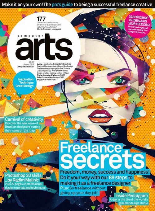
Magazine cover page graphic design serves as the vanguard of visual communication, an inviting threshold that beckons readers into a world of ideas, perspectives, and creative narratives. Much like an artisan carefully crafting a piece of art, a designer molds various elements to produce a cover that not only represents the content inside but also encapsulates the zeitgeist of the present moment. The interplay of imagery, typography, and color selection draws the viewer’s eye and ignites curiosity; it dictates the emotional resonance between the reader and the publication.
First and foremost, understanding the anatomy of a magazine cover is paramount. It consists of several integral components: the title, imagery, headlines, and supplementary texts. The interplay between these elements can be likened to the symphony of an orchestra, where each instrument has a defined role yet must harmonize with the others to produce an enthralling auditory experience. The title acts as the overture, establishing the thematic direction while bold imagery offers the visual crescendo that captivates attention.
Imagery serves as a powerful metaphorical canvas. In the realm of magazine design, the image chosen can either illuminate the narrative or obscure it. A meticulously curated photograph or illustration has the potential to convey profound emotion, evoke curiosity, and even reflect societal currents. Consider the impact of a stark and bold photograph depicting climate change; it can serve as a poignant reminder of the urgent issues at hand. On the other hand, whimsical illustrations might invoke a sense of nostalgia, transporting readers back to simpler times and evoking a yearning for connection. The juxtaposition of these visual elements offers designers an expansive latitude for creativity.
Moreover, typography emerges as another vital vessel for communication on a magazine cover. Each font bears intrinsic characteristics that contribute to the overall message. A serif typeface might suggest tradition and reliability, while a sleek sans-serif font could evoke modernity and innovation. The choice of typography is not merely an aesthetic consideration; it is a deliberate decision that influences the reader’s perception and engagement. When juxtaposed with visual imagery, the typography serves as a clarion call, beckoning the audience to delve deeper into the content.
Color theory also plays a significant role in the effective graphic design of magazine covers. Color is imbued with psychological implications; certain hues can elicit feelings of warmth, tranquility, or urgency. A cover drenched in vibrant yellows and oranges might convey optimism and energy, beckoning the reader into a world of exuberance. Conversely, cooler tones such as blues and greens might create a sense of calm, encouraging introspection. The strategic use of color paves the way for designers to subtly guide the audience’s emotional journey.
Incorporating negative space is another critical aspect that can elevate a magazine cover from the ordinary to the extraordinary. The areas without visual noise allow readers’ eyes to rest, enabling the key messages to stand out more prominently. This concept of using ‘white space’ can enhance focus, drawing the viewer’s attention to the cover story and important details. It creates an implicit dialogue between elements, fostering a sense of balance and sophistication.
The unique appeal of magazine cover design is further accentuated by the ever-evolving trends within the graphic design landscape. From minimalist styles that boast a crisp, clean aesthetic to maximalist designs bursting with vibrant imagery, every decade imparts its own flavor on magazine covers. For instance, the contemporary trend towards sustainable practices has inspired many designers to employ eco-friendly materials and processes, symbolizing a commitment not only to aesthetics but to the planet. Cover designs are increasingly incorporating recyclable materials and environmentally-conscious inks, highlighting the responsibility that comes with the artistry.
Moreover, the digital era has catalyzed a transformation in the design process, expanding the horizons of what is possible. The advent of technology enables designers to experiment with enhanced interactivity on digital covers. Readers can now engage with magazine covers in unprecedented ways, such as via augmented reality (AR), where a simple scan can unfold layers of content beyond the printed page. This fusion of design and technology is representative of a broader trend in which interactivity adds dimension to the user experience.
Nevertheless, despite these advances, the essence of magazine cover page graphic design remains rooted in connection. A well-designed cover not only encapsulates the publication’s ethos but also resonates with its target audience, forging bonds that transcend the page itself. Ultimately, the cover serves as an invitation—a tactile bridge merging the physical object with the rich, intricate stories contained within. It engages the viewer’s imagination while also serving as a mirror reflecting broader cultural dialogues.
In conclusion, magazine cover page graphic design encapsulates a multifaceted synthesis of creativity and strategic communication. It is an art form that goes beyond mere aesthetic appeal; it is an inquiry that delves into the nuances of human emotion, societal constructs, and cultural symbolism. Each cover tells a unique story, representing not only what is within its pages but also the collective consciousness of an era. As the world of graphic design continues to evolve, particularly with pressing global challenges such as climate change, the role of magazine cover design will be pivotal in shaping conversations and inspiring change. Through innovative designs and conscientious methodologies, the humble magazine cover can leave an indelible mark on the reader’s psyche, reminding them of the beauty of storytelling through design.
