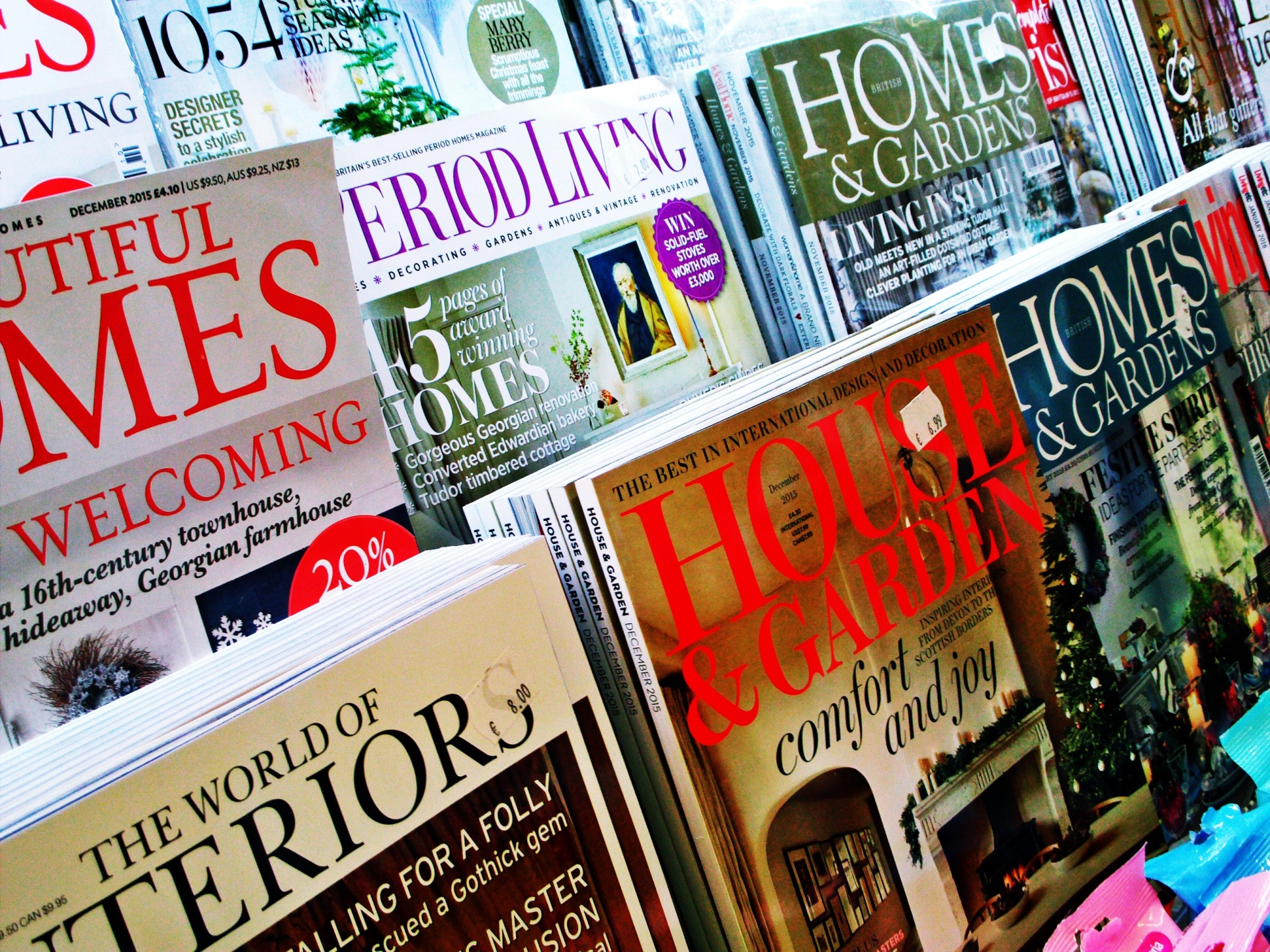
Magazine cover page design occupies a unique niche in the realm of visual communication, merging artistry with marketing strategy to capture the attention of potential readers. The design of a magazine cover serves not merely as a decorative front but as a crucial touchpoint that encapsulates the essence of the publication within. Readers instinctively gravitate toward visually striking covers, often influenced by a strange confluence of aesthetics and curiosity. This fascination with magazine cover design can be attributed to several underlying factors, including psychological triggers, market trends, and cultural resonance.
One of the initial facets to explore in this discourse is the psychological impact of a magazine cover’s design. The human brain is wired for visual stimuli, which can evoke emotions instantaneously. The use of vibrant colors, striking images, and compelling typography leverages this instinctual response. A well-crafted cover engenders intrigue, enticing individuals to delve deeper into the content within. Think about how certain colors resonate with you; red may invoke feelings of urgency, whereas blue could instill calmness. Designers meticulously select hues and layouts to elicit specific emotional responses. Thus, the cover acts as a silent gatekeeper, influencing reader engagement predicated on visual appeal.
This emphasis on aesthetics finds its roots in marketing principles that dictate consumer behavior. The cover is akin to a storefront window; it must attract and persuade. Attention spans are fleeting in today’s frenetic society, where readers are inundated with choices. The design must hence be both alluring and informative, encapsulating the magazine’s unique selling proposition. Consider how leading publications invest significantly in their cover designs, reflecting not just artistic intent, but a strategic business decision aimed at maximizing attraction and readership.
Furthermore, magazine cover design provides a platform to signify not only trends but cultural and sociopolitical themes. A magazine like Vogue, for example, has historically employed cover art to reflect prevailing notions of beauty and fashion. Conversely, publications like National Geographic emphasize nature and wildlife, advocating for environmental consciousness through their cover imagery. The choice of subject matter often speaks volumes, hinting at the publication’s values and aligned ideology. This iconic representation resonates with contemporary societal issues, allowing magazines to participate in ongoing dialogues about identity, representation, and the future.
The interplay of typography and imagery is critical in synthesizing a coherent design that articulates a magazine’s narrative. Fonts communicate personality; serif fonts may denote tradition and trustworthiness, whereas sans serif might suggest modernity and openness. An astute designer harnesses this interplay to forge an emotional connection with readers. For instance, the juxtaposition of bold headlines against muted backgrounds can create a dynamic tension that compels a closer inspection. Therefore, typography is not merely a tool for conveying information; it is a pivotal player in the overall aesthetic and communicative intent.
In the realm of product design, the magazine cover serves as an exemplar of the principles of visual hierarchy. Key elements—be it the title, feature articles, or standout visuals—must be arranged to guide the observer’s eye across the page. The layout must adhere to a rhythmic cadence, ensuring that critical information is discernible at a glance, while less vital details maintain a supportive role. This strategic arrangement demands a deft balance between chaos and order—a juxtaposition of elements that together form a holistic vision while retaining individual significance.
The influence of technological advancement cannot be understated in the evolution of magazine cover design. Digital tools have revolutionized the creative process, allowing designers to experiment with layers, shadows, and textures in ways previously confined by physical limitations. This accessibility has bred a new era of creativity, resulting in innovative designs that are interactive and engaging. For instance, augmented reality features on magazine covers invite readers to engage dynamically with the content, thereby layering additional narrative elements that traditional print cannot offer.
Yet, amidst the avant-garde aesthetic approaches, there lies a critical underpinning: sustainability. With the growing emphasis on climate change and environmental conservation, designers are increasingly tasked with finding innovative ways to produce captivating covers that are ecologically responsible. This involves sourcing materials that reduce environmental impact, using sustainable inks, and designing covers that can be recycled or repurposed. The marriage of aesthetics and sustainability echoes a larger cultural shift, where conscientious consumerism becomes a hallmark of modern brand identity.
The fascination with magazine cover design transcends its immediate visual impact; it is imbued with deeper reflections on societal values, human psychology, and market dynamics. As designers continue to innovate and adapt, the magazine cover will remain a vibrant canvas, adaptable to the evolving zeitgeist. Each cover is an opportunity to tell a story, to ignite curiosity, and to evoke change, compelling readers to engage not just with the publication, but with the broader issues that shape our world.
In conclusion, the study of magazine cover page product design is a rich tapestry interwoven with creativity, psychological insight, and cultural commentary. The next time you encounter a magazine cover, take a moment to dissect its design elements, understanding the intricate layers that inform its visual narrative. This exploration not only enhances your appreciation but also contributes to a broader conversation about the role of design in shaping perceptions and behaviors.