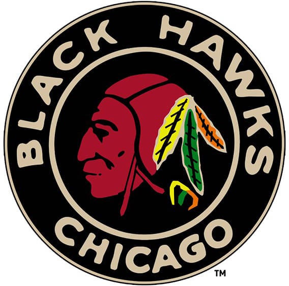
The Chicago Blackhawks, one of the most storied franchises in the National Hockey League (NHL), possess a logo that has evolved significantly since its inception. This emblem, synonymous with the team’s identity, encapsulates a rich tapestry of cultural, historical, and societal influences that mirror the progression of the franchise and its interactions within the broader American cultural landscape. This examination elucidates the evolution of the Chicago Blackhawks logo from a cultural relativism perspective, encapsulating themes of tradition, transformation, and societal perceptions.
Initially designed in 1926, the inaugural Blackhawks logo featured a straightforward, stylized representation of a Native American head, designed to embody strength and resilience. This early depiction reflected a broader trend among sports teams of the time, which often appropriated indigenous imagery to signify valor and power. Delving into cultural relativism, one can observe that this usage requires an understanding of the historical context in which these symbols were conceived, as well as the implications of their continued use in contemporary society.
Throughout the subsequent decades, the logo underwent subtle modifications, indicative of prevailing artistic trends and societal attitudes. In the late 1930s, the team adopted a more detailed and vibrant version of the Native American head, characterized by intricate feather work and a more pronounced visage. The changes emphasized not only the artistic evolution but also the growing commercial appeal of sports branding, as teams sought to cultivate identities that resonated with their fan bases.
By the 1970s, the Blackhawks logo crystallized into its most recognizable form, featuring a color palette that primarily utilized red, black, and white, alongside a depiction of the Native American head rendered with considerable detail. This iteration not only became emblematic of the Chicago franchise but also served to ignite discussions around cultural sensitivity. This discourse raises pertinent questions: At what point does cultural representation devolve into cultural appropriation? And how do societal values shape the acceptability of such representations across time?
The Blackhawks logo has faced scrutiny from various quarters, particularly from native advocacy groups who argue that the appropriation of indigenous symbols perpetuates stereotypes and undermines the rich cultural heritage of Native American peoples. Such critiques challenge fans and stakeholders to re-examine the historical narratives surrounding indigenous representation in sports, advocating for a thoughtful engagement with these symbols that transcends mere aesthetic appreciation.
In the 1990s, as societal awareness regarding cultural issues heightened, the Blackhawks undertook a cautious approach to their branding. While the logo remained unchanged, the team made concerted efforts to educate fans about the complexities of Native American culture, fostering dialogue around the significance of the imagery. This response exemplifies a larger trend in professional sports aimed at mending relationships with marginalized communities through education and sensitivity.
Transitioning to the 21st century, the Chicago Blackhawks incrementally embraced a more inclusive narrative. The implementation of community outreach programs and initiatives aimed at fostering dialogue between the franchise and Native American communities underscored a commitment to cultural understanding. Moreover, the team engaged with artists from indigenous backgrounds to reimagine representations, signaling a shift towards collaborative interpretation rather than unilateral appropriation.
Today’s logo maintains its historical elements while embodying an evolving narrative that respects its origins. In contemporary discourse, the team’s emblem is no longer merely a representation of a singular cultural identity but rather a complex symbol signifying resilience, tradition, and transformation. This engagement with cultural relativism calls for a nuanced recognition of the multifaceted relationships between sports, identity, and societal values.
The trajectory of the Chicago Blackhawks logo serves as an illustrative case study for examining not only the evolution of branding in sports but also the intricate interplay of culture, society, and identity. As stakeholders continue to navigate the complex landscape of representation, it becomes imperative to foster an environment where dialogue and education prevail over one-dimensional viewing of cultural symbols.
Consequently, the ongoing exploration of the Blackhawks logo offers a lens through which we might scrutinize the broader implications of cultural representations in sports. It invites reflection on the power dynamics inherent in the appropriation of cultural symbols and the potential for reconciliation between sports franchises and the communities whose identities they invoke.
In summation, the history of the Chicago Blackhawks logo represents a microcosm of the broader cultural dynamics at play within American society. As the logo has morphed through the decades, it has encapsulated an array of historical narratives, societal tensions, and cultural dialogues. This premise reinforces the notion that symbols in sports are not merely aesthetic but embedded with cultural significance, capable of evoking strong emotions and dialogue across different communities. Exploring such history places us at the intersection of tradition and transformation, urging a reflective consideration of how we engage with cultural symbols in the modern era.
