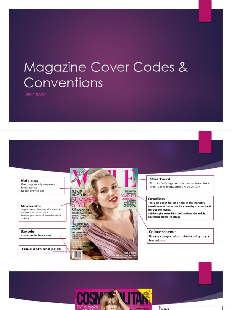
In the world of print media, magazine covers serve as the vanguard of a publication’s identity. The colors, typography, and imagery all coalesce on the cover, creating an immediate impact and enticing readers to delve into the issue within. Among these design elements, color reigns supreme, influencing perceptions, evoking emotions, and shaping narratives from the very first glance. The fascination with magazine cover page color codes lies not only in their aesthetic allure but also in the psychological and sociocultural underpinnings that guide their selection.
Color theory posits that each hue elicits specific feelings and associations. For instance, red is often correlated with passion or urgency, making it a popular choice for covers that aim to portray drama or attract immediate attention. Conversely, blue generally represents calmness and stability, providing a contrasting narrative that can underscore themes of trustworthiness or serenity. This intrinsic relationship between color and emotion forms the bedrock of why certain palettes are chosen to represent specific magazines.
Furthermore, cultural connotations play an equally integral role. In Western societies, white typically signifies purity and simplicity, which is often leveraged in lifestyle and wellness publications. In contrast, in some Eastern cultures, white can suggest mourning or loss. The same color can transform in meaning across different societal contexts, highlighting the importance of cultural sensitivity in design. Designers must often navigate these nuances to ensure their work resonates positively with the intended audience.
Another fascinating aspect of color choice on magazine covers is the concept of color psychology. The study of how colors affect human behavior has broad implications, especially in marketing and branding. Color can be a powerful communicator; it can convey urgency, optimism, or professionalism, all while bypassing verbal language. For instance, the abundant use of vibrant hues such as yellow or orange can invoke a sense of optimism and enthusiasm, usually seen in covers that feature uplifting stories or celebratory themes.
Supporting this notion, some magazines adopt a consistent color palette across their issues to establish brand identity. Consistency breeds familiarity, creating an almost instinctive recognition among readers. Popular lifestyle magazines often opt for pastel tones to create an aura of softness and comfort. In contrast, fashion magazines may embrace bold, stark contrasts to convey a sense of luxury and sophistication. These strategic choices are not arbitrary; they are meticulously curated to resonate with or challenge the values of their readership.
Moreover, examining magazine cover color codes unveils deeper societal trends and shifts. Designers often respond to the zeitgeist, incorporating prevailing social movements or cultural phenomena into their work. For example, covers that emphasize eco-friendliness may showcase greens and earth tones, aligning with the growing consciousness towards sustainability. In this context, color is a vehicle for advocacy, extension of a publication’s values, and an embodiment of the social discourse surrounding climate change.
The impact of color on magazine covers is also magnified through visual hierarchy. Designers utilize contrasting colors to draw attention to specific elements, such as headlines and images. For instance, a vividly colored title against a muted background can create a striking focal point, encouraging viewers to engage with the text. The interplay of colors not only enhances visual appeal but also guides readers through the intended narrative journey, meticulously crafting an experience that resonates at both conscious and subconscious levels.
However, modern trends are also challenging long-standing conventions. The rise of minimalism has seen a departure from the busy covers of yesteryears, with many publications opting for monochromatic schemes or sparse designs. Such choices reflect broader societal shifts towards simplicity and clarity in a world inundated with information. These minimalist approaches often employ a single bold color to make a statement, inviting reflection and engagement rather than mere reaction.
Furthermore, digital advancements have transformed the art of magazine cover design. With the proliferation of social media and online platforms, covers must now compete for attention within a limited space. As a result, the importance of impactful color choices is magnified within this competitive landscape. Creating a cover that stands out amidst an avalanche of digital content necessitates innovative uses of color to capture fleeting attention spans.
Lastly, the significance of magazine cover color codes extends beyond aesthetics; they engage with the reader’s sense of identity and belonging. The colors chosen reflect the values, aspirations, and tastes of the target demographic, creating a bond that transcends the physicality of the publication. A vibrant, inclusive cover can stimulate a sense of community, fostering connections among readers who share similar ideals or experiences.
In conclusion, the color coding of magazine covers is a profound interplay of design, psychology, culture, and societal trends. By thoughtfully deploying color palettes, designers craft not just visual stimuli but also a narrative framework that reflects and shapes the readership’s beliefs and identity. The fascination with these colors and their codes underscores a collective desire for connection, meaning, and resonance in an ever-evolving world. This intricate tapestry of color choices not only attracts attention but also serves as a microcosm of the broader social landscape, hinting at deeper currents and collective narratives that merit exploration and understanding.
